Tuesday, 18 December 2012

Katie's gradient tests


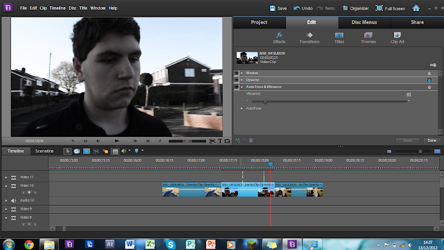
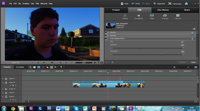
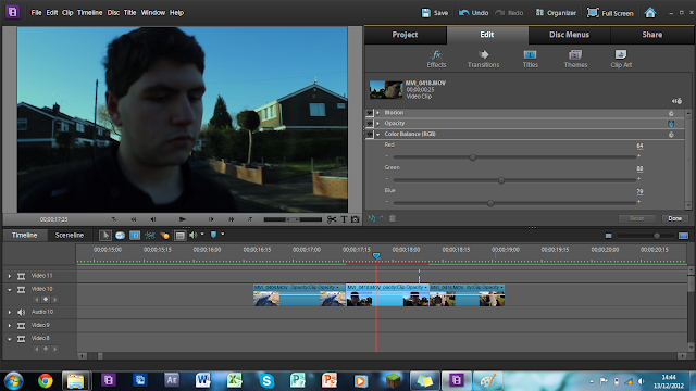
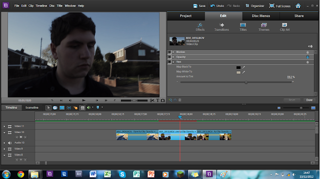
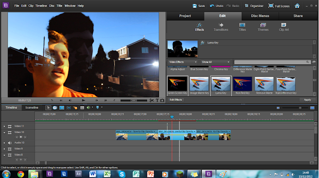
katie's gradient tests, for our clip at the end we want to possibly change the way it looks, to disguinish between the narrative and story sections, i quite like 2 and 6, purely because 6 looks completely ridiculous and 2 is subtle and is more dull than the birght orangey glow of the narrative.

Update 7.0

We filmed on Friday our last sequence, we included pretty much Emily and reece in a party scene and walking into a house, with typical love connotations and teenag connotations, as production  director, I thought it would be a good idea to have alcohol around the home and have different shots of them in different areas of the home (as a group we thought of the fridge idea). However me and katie are not agreeing on the ending of the clip, she wants it to end it where reece is in bed (pretending to have sex), where as I want to end the clip with clothes being thrown against the wall.  (Pics of the shooting will be uploaded later tonight when Katie can screen grab photos from it.)

Wednesday, 5 December 2012

Art Direction - Chosen!


We have nearly nailed down our art direction, we have chosen to go for a more noir stark type with small bits of very strong colour ( which would represent something or draw the attention of the audience, these may even try to emphasise what the connotations are (Sex, Drugs etc). Personally I prefer these to our other  concepts due to a more artisitc feel. however we still haven't decide wether we are going to use the drawings or not, (possibly for the front cover?)


Tuesday, 4 December 2012

Font Ideas


(Comic Sans is just for Mr Earl, as he loves the font)
 
Katie said she hated the font on our cd ideas, fair enough, but she's just telling we need bold font, and not really helping in telling me what she wants, the problems is that she's uploaded albums of linkin park, which is more like street art etc.


Monday, 3 December 2012

Media Rough Cut

Taken from Katie's Blog:


'This is our current rough cut, the live peformance is synced and alinged correctly, the narrative now just needs adding and the editing process trimmed a bit to have higher paced editing. I decided to have this as the rough cut as it is probably best that we fine tune the live peformance first then the narrative, working in layers that can change in transparency (basic viewing point) so we can decide what we want or where we want to cut and can go back later. It's a youtube video only because its a HD video and would take hours to upload to either blogger or vimeo.'