Tuesday, 18 December 2012

Katie's gradient tests


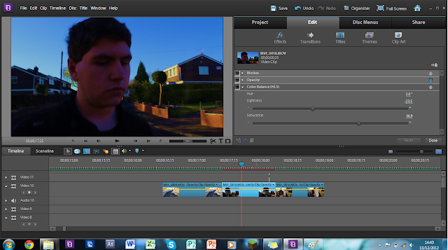
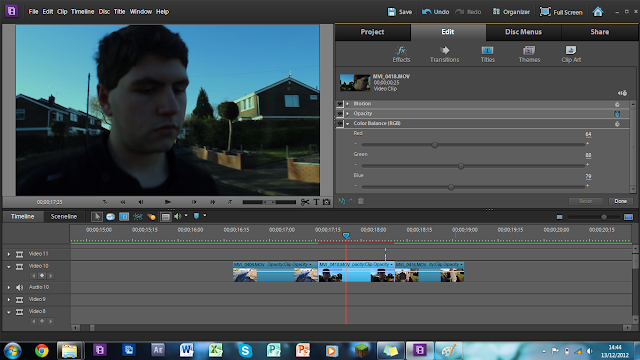
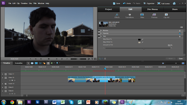
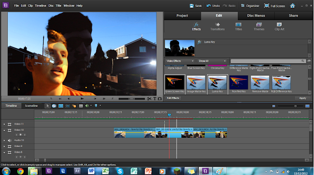
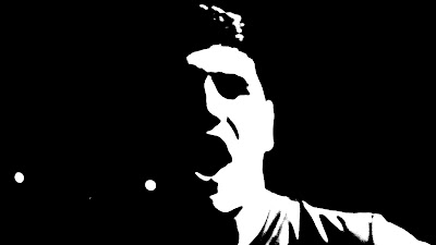
katie's gradient tests, for our clip at the end we want to possibly change the way it looks, to disguinish between the narrative and story sections, i quite like 2 and 6, purely because 6 looks completely ridiculous and 2 is subtle and is more dull than the birght orangey glow of the narrative.

Update 7.0

We filmed on Friday our last sequence, we included pretty much Emily and reece in a party scene and walking into a house, with typical love connotations and teenag connotations, as production  director, I thought it would be a good idea to have alcohol around the home and have different shots of them in different areas of the home (as a group we thought of the fridge idea). However me and katie are not agreeing on the ending of the clip, she wants it to end it where reece is in bed (pretending to have sex), where as I want to end the clip with clothes being thrown against the wall.  (Pics of the shooting will be uploaded later tonight when Katie can screen grab photos from it.)

Wednesday, 5 December 2012

Art Direction - Chosen!


We have nearly nailed down our art direction, we have chosen to go for a more noir stark type with small bits of very strong colour ( which would represent something or draw the attention of the audience, these may even try to emphasise what the connotations are (Sex, Drugs etc). Personally I prefer these to our other  concepts due to a more artisitc feel. however we still haven't decide wether we are going to use the drawings or not, (possibly for the front cover?)


Tuesday, 4 December 2012

Font Ideas


(Comic Sans is just for Mr Earl, as he loves the font)
 
Katie said she hated the font on our cd ideas, fair enough, but she's just telling we need bold font, and not really helping in telling me what she wants, the problems is that she's uploaded albums of linkin park, which is more like street art etc.


Monday, 3 December 2012

Media Rough Cut

Taken from Katie's Blog:


'This is our current rough cut, the live peformance is synced and alinged correctly, the narrative now just needs adding and the editing process trimmed a bit to have higher paced editing. I decided to have this as the rough cut as it is probably best that we fine tune the live peformance first then the narrative, working in layers that can change in transparency (basic viewing point) so we can decide what we want or where we want to cut and can go back later. It's a youtube video only because its a HD video and would take hours to upload to either blogger or vimeo.'


Thursday, 29 November 2012

Dual page (with Lyrics)


After Katie saying she would rather see the edited photographs with Lyrics, rather  than the drawings me and reece decided to try them out, im not that keen, however Reece quite likes them, but well have to get Katies opinion also.  Ill be honest, i really like the 1st one with the stylised photo, aswell as the last one with the lyrics.  

Wednesday, 28 November 2012

Digipack Full page design


As a concept for our digipack, we wanted to have a 2 page parts that would combine a edited photograph, and the crude drawings. As a quick mock together and concept, I put them together to see what they would look like together, obviously the symbol and picture don't match, but I just wanted to se if it would fit together. I think it looks rather nice, and keeps with the conventions of alternative rock, and as a double page it looks liek it could really stand out. What do you think?

2 more designs


Some more designs i've done today, the sex symbol is to portray the coventions of sex in alternative rock (obviously), how I don't particuarkly like that design, it was the first one we did before whe chose the right brushes and the right style, we I doubt we will actually use that one.However, the second one I feel is quite nice, it has the crude effect, and the bright rd/pink really stands out and it feels like a really random sketch.

Tuesday, 27 November 2012

Update 6.0

Just to update our current events, Katie is M.I.A, so we have no idea wheres shes at or whats she doing a the moment. Hopefully, she is continuing to edit the video to be ready for our rough cut by the end of the week, although speaking that we desperately need to finish off our last bit of filming in the house, hopefully we will be able to do it one day after sixth form, or on Saturday.

As for work I'm doing, i'm still chipping away on doing digipack designs and editing photo's using Photoshop, and with Reece's help, looking at which ones work and don't work and trying out different ideas.

Plan of action this week is to:

Finish Digpack Concepts
Begin Logo designs
Begin poster designs 

Digipack designs


An idea we had for the digipack was to have dual pages, with one side having a edited photo either from the shoot or not, and on the other side, have a crudely drawn images of the usual conventions of Alternative rock, which would relate to the image.  So for example, a smoking picture would have a drugs symbol on the other side.The reason we did this, is because many albums we have seen have a 'crude look', which often looks messy or unpolished look, and for ours, we wanted something similar but with a artistic edge.

Concepts for the Digipack:


Wednesday, 21 November 2012

Update and Digipak designs

Just an update on what we are doing today and lately, Katie is hammering away on Elements to get the rough cut all done and finished for the end of the month, whilst I started on editing photo's from our friday shoot and saturday shoot, we thought that if we split our tasks up, we can get more things done and quicker.

 As for the digipak, I used some shots and stills from the filming, and edited them on Photoshop Elements, we thought that if we used our own photo's for it, it would feel more connected tot he band and the videos rather than just random pictures that may not relate to the band. For the digipak, we really wanted to hammer home the conventions of the Alternative Rock genre, which are Drugs, Sex, Alcohol and Teenage culture or Music, so as an idea we wanted to have different images that relate to these conventions, and have a individual logos that would appear to the side of these pictures.

Concept designs so far.


Tuesday, 20 November 2012

Update 5.0 (Vinyl)

Me and Katie were talking over Facebook, and were toying with the idea of having a Vinyl aswell as our digipack for our album, we have seen from our research that many Alternative Rock bands have an alternative style vinyl, which is usually a limited edition version of what they produce.

As you can see from my research, Enter Shikari have a vinyl cover (which is sold out) of their 'Flash Flood of Colour' album, as do Muse of their 'The Resistance' album. The general conventions of a vinyl cover are they are alternative versions of the original CD covers, whether that be a different color scheme, or the same idea portrayed differently. Some bands such as Muse have numerous version of Vinyls and are all limited editions. With a vinyl we can also show in our project we are going further than required, and we can also show that we are putting our research to good use.

It's also good to note that Vinyls are coming back into fashion, but rather people listening to them, people tend to collect them or have them from their favourite band (I am guilty of this, I bought a Linkin Park Minutes to Midnight Vinyl in America for $10, I only bought it because it was Linkin Park), so Retro technology is in fashion and it sells well (and sells out very quickly). I wonder if cassettes ever come back.  


Update 4.0

Today me and Katie (Reece was ill), managed to put the first part of our clip together, and just so that we can get a rough edit together and see what we can do, by putting the main track in, and just putting all the other clips of what we shot in layers and syncing then to the music (Something we have really well done so far is the syncing). We hope to have a rough cut (with no effects just the cuts in the right order) by the 30th of November, or even earlier if possible, as we want to have enough time to really polish our video, yet leave ourselves enough contingency time in case their are any problems (none so far!).

However we aren't 100% finished yet, we still have another few scenes to film which i think are being filmed this week. The scenes we need to film are the end narrative of when the two protagonists enter the house and have a party, and then the very beginning of the narrative of when they are in the classroom. These scenes aren't particularly long and I think the beginning section will take no longer than an hour to film with the ending possibly taking 2 hours to film, so there isn't much left to do.

As for editing, we will all have an input into it, however we are thinking of spliting the group up, to be able to work on different things and tailor to our 'talents' (I cringed when I used that word), for example : Katie will be mostly involved in editing due to her vast knowledge of the editing software, I will be on hand to do the Digipak and Advert since I know how to use Photoshop and Sketchbook pro, and Reece I think will be helping out with both.

Saturday's Narrative Shooting

Saturday's shoot went very well, we were able to film a large amount of footage to use (Such as the scenes were they meet togther take drugs, hold hands and a drunken sequence), however we need to do more such as the party scene etc.

The shots we have taken and to katie's credit they are excellently well done, we have a few master shots and have different angles in each, we have experimented with Focus and out of focus shots, aswell we have taken many pictures of good qualitly that we may be able to use in our digipak, the photos are a large file so i have alot of space to play around with them on photoshop.


Saturday, 17 November 2012

Friday's Live performance

Friday's live performance went well, depsite having a limited time frame, we managed to be able to do 3 master shot run throughs, and then numerous shots at different angles, allowing us o have lots of footage to be able to use, as well as excess footage incase something goes wrong. We had no interupptions or hiccups so everything filmed accordingly.

Roles:

Reece - Acoustic Guitar and lead Vocals
Katie - Drums
Me - Bass Guitar and Pack Mule


Friday, 16 November 2012

Update, pemission for Instruments

After Katie and reece panicking about the instruments, I have permission for the folowing items from Mr Lamb:

Bass Guitar
Acoustic Guitar
Electric AMP
Drum Kit

Location Spotting


These are from reece's blog, and where we will shoot our live performance, hopefully light will not be an issue, and we have a short window to film what we need (The floodlights come on at 4:30, and school shuts at 6:00)

Outfits

Katie's Ouftit for the live performance


Reece's Outfit for the Live performance


My Outfit for the live performance (Will be uploaded, it's a System of a Down shirt)


For the live performance, we want to portray the usual conventions of the Alternative rock, so we looked at other Alternative rock videos, and they all tend to be eithier wearing other band's t-shirts or just average clothing, so me and katie decided to wear band clothing whilst Reece wears typical teenager clothing.

An interesting thing in other Alternative rock videos, is that some videos the Band t-shirts aren't usually from the same genre as the same they are in, for example in Sum 41's Fat Lip they guitarist is wearing a Guns and Roses Shirt.

Thursday, 15 November 2012

Step by Step narrative

Just to make it easier to see, instead of going through the storyboard, me and reece did this:


  • shot of a boy and a girl sitting in opposite sides of a classroom, both hard at work, when the boy hits the table in anger (due to the work), which makes the girl turn around  quite timidly, who catches the eye of the boy and vice versa, who smile at each other and then urn back to their work.
  • Then a shot of the girl noticing the bell going, picks up her work and leaves to go away from the table, yet the boy is still working.
  • Then a shot of a corridor (Time lapse) of people moving around, to mark the end of the day.
  • Girl walking down the street with books in her hand and knocks into the boy, then which she drops her books and he offers to pick them up, they start to converse.
  • We then cut to a bench scene, and the boy gets drugs (Tic Tacs) from his pocket and gives them to the girl. They both take them.
  • Stumbling into house, as they get into the house they continue to take alcohol.
  • Drug and alcohol begins to take effect as they start to kiss (Not actually kissing, the camera suggest this)
  • Clothes are thrown against the wall and onto the floor to indicate ‘sex’ (again suggested) then cuts off to the end

Tuesday, 13 November 2012

Testing, Editing, Um Thing.


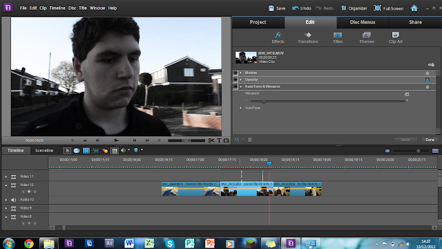
In my attempt to make something like Judge Dredd Slo-mo, I failed miserably, however, after played around with Premier elements 10, I got this effect, which i believe that could work to portray drugs (I doubt it would actually look like that but people could understand it being drugs i think)

Basically I shot the original clip on my tablet, and slowed it down and then added blurring and contrast features and then another filter that made it go 'funky' (i can't remember the name of the filter).

Monday, 12 November 2012

Retrospective


Retrospective (oops abit late)

What is similar and what is different?

What is similar? A familiar structure within the blog, planning, research of other videos and looking at other companies and presenting ideas of what I would like to do etc etc. However for this I feel like I am being more detailed (Probably not enough I admit but I’m working away to get it on), I feel like we need for this project to be more detailed and clearer and more prolific in our work (Again guilty of not being it). Although for the project this time, we are going to do numerous runs of the shots (something I didn’t do last time) and as for the Live peformance, we going to do lots of run throughs with different camera angles, so that incase when we do our proper shots, and if they go badly, we can use our run-through footage as a backup.

What lessons did you learn?

Plan, Detail and make sure you track others to keep up with everyone else,  also be prepared incase something goes wrong, I can’t saying yet about when we film (No doubt something will happen), but as Qui gon Jinn says ‘Be prepared for the unexpected. Will be update when we finish filming

How have you made sure that you didn't make the same mistakes or that you achieved the same successes?

Well for the filming we can’t quite say just yet, however to prevent my mistakes, like I said we are going to film full run throughs in one shot in different angles so we have enough footage, I’ll edit this post accordingly to see if we had the same success.

How will you make sure that your shoot and edit run more smoothly than last time?

To ensure our shooting is more smooth, we are giving ourselves plenty of time to film and enough ‘Contingency’ time incase something goes wrong, Editing wise, to make sure we get it done quicker, we are editing on katie’s laptop and rendering it all on my pc (My pc can render these things insanely quick and in HD. 
Friday, 9 November 2012

Editing Idea (DREDD)


I know I’m jumping the gun here but after seeing the film DREDD 3D I had a an idea for our music video. Throughout the alternative rock one of the main conventions of it is that they usually explore the idea and the use of drugs and the impact of how it has on the ‘Teen culture’. And often how this is present is in a very stylised way, either through a an unusual camera shot or through very stark editing.


So looking at this screenshot of the ‘Slo-mo drug’, we can clearly see a very high contrast and lighting within the shot, they use these very stark editing techniques to show how drugs effect the brain and change the perception of what we see. In our clip I would love to use something very similar to this briefly within the song, to portray how drugs are in teen culture.

As for actual editing, I would have very much similar in the sense with the high contrast and high exposure, with it in the shot turning into that type of edit and possibly with it changing the hue (or colour) very quickly along the colour spectrum. An idea reece had was that it could be in a pov shot, as we don’t see many POV shots in Alternative rock so it would be a nice idea to toy around with it, also aswell with a POV shot we could give the effect that it’s actually the view who is taking the drug also.

Katie has said that she knows a possible way we may be able to pull off this effect, and with the help of James we maybe be able to!