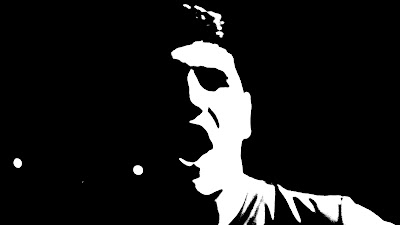
Just an update on what we are doing today and lately, Katie is hammering away on Elements to get the rough cut all done and finished for the end of the month, whilst I started on editing photo's from our friday shoot and saturday shoot, we thought that if we split our tasks up, we can get more things done and quicker.
As for the digipak, I used some shots and stills from the filming, and edited them on Photoshop Elements, we thought that if we used our own photo's for it, it would feel more connected tot he band and the videos rather than just random pictures that may not relate to the band. For the digipak, we really wanted to hammer home the conventions of the Alternative Rock genre, which are Drugs, Sex, Alcohol and Teenage culture or Music, so as an idea we wanted to have different images that relate to these conventions, and have a individual logos that would appear to the side of these pictures.
Concept designs so far.


These are interesting. It might be useful to start mocking up some rough ideas for text etc., just to start considering typeface/ colour/ layout etc. (remember that a digipak will generally follow a square aspect ratio).
ReplyDeleteWith regard to a vinyl version, you could do that but it would need to be additional to, and you would need to think about how the design would need to change. It's a nice idea, if you have the time.